Transitional Style Renovation
Project Type: Residential
Description
We took traditional elements and helped to transition them into a more modern clean style.
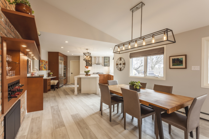
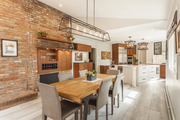
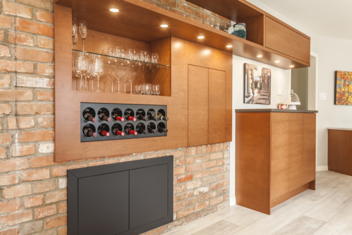
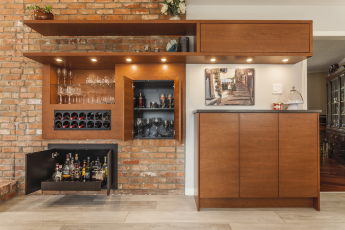
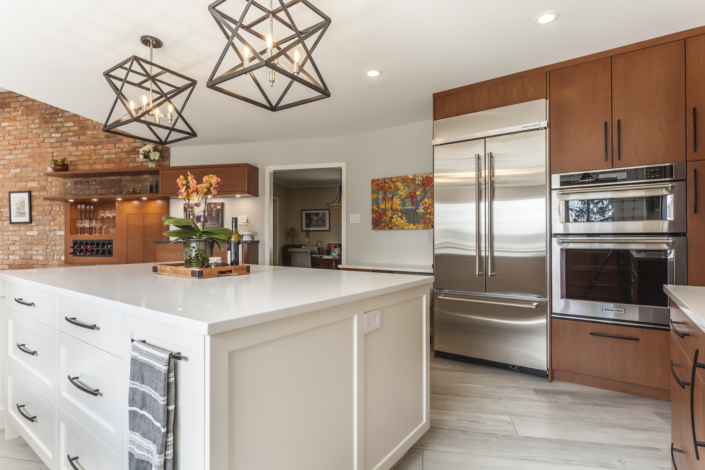
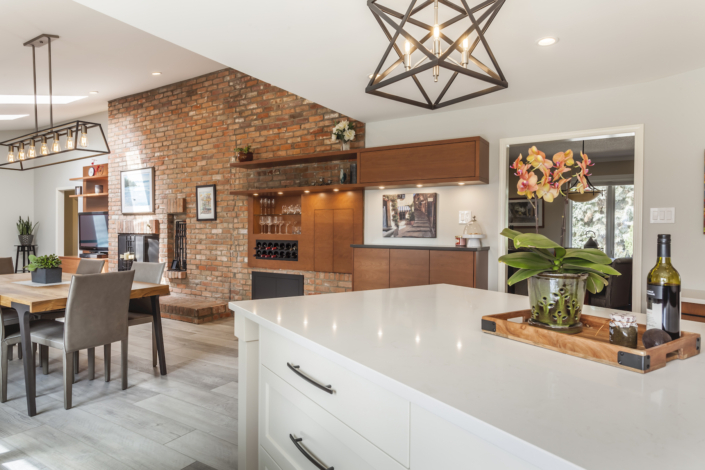
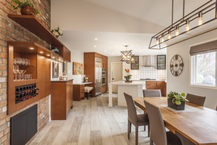
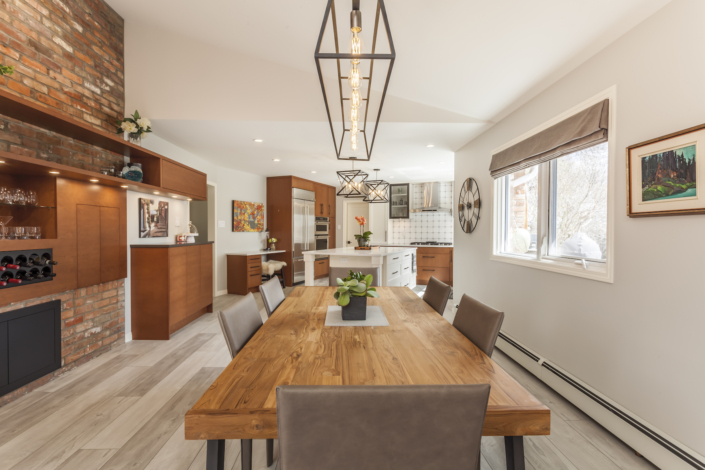
This space was an exciting one to work on. The contractor, Hager Developments, brought me in on this job. The clients were looking to renovate their kitchen and main living area. The plan was to open the wall between the existing kitchen area and living area. The clients had some concern that the space would appear too long. It was definitely going to be a wide expanse, but with a beautiful brick fireplace feature wall between the two spaces, it seemed to make sense to turn it into one large space.
Once the details of the structure were determined, the client’s and I got to work on the finishes. There were still parts of the home that would not be renovated at least not in the immediate future, so we wanted to ensure that the space still flowed and complimented.
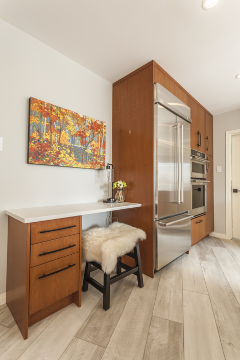
The tv room and a formal dining room off of the kitchen had a rich cherry wood floor. It was lovely, but the client really wanted a more modern clean look to her home. With this in mind, we started to look at flooring for the areas to be renovated. The client’s determined that they wanted to do a luxury vinyl plank instead of hardwood. It was more cost effective and also suited their tastes. They initially thought to try and match a vinyl plank to the hardwood. In my experience, this generally doesn’t work. What we needed to do was compliment the two floors to each other.
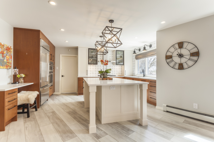
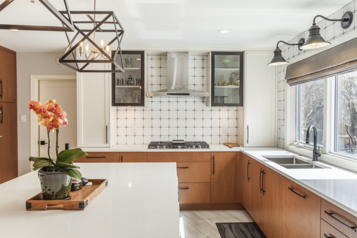
With the idea that the client’s wanted a clean fresh style, I encouraged them to consider a light floor. We had already determined that the kitchen cabinets would be a combo of white and cherry, so a light floor seemed like a viable option. Also, we were keeping the aged terracotta feature brick fireplace wall. More warm colours on the floor didn’t seem to make sense. Plus the client’s were drawn to light clean colours. We found the perfect luxury vinyl plank in a washed white grey colour. It wasn’t what the client’s had expected, but they found they really loved the idea of it.
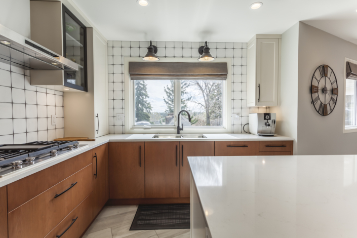
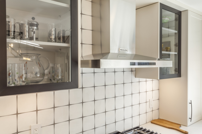
One of my favourite finds for this home was the stunning white stone tile backsplash in the kitchen. Amazing how the cut edges on a square tile changes everything. So simple in yet so impactful.
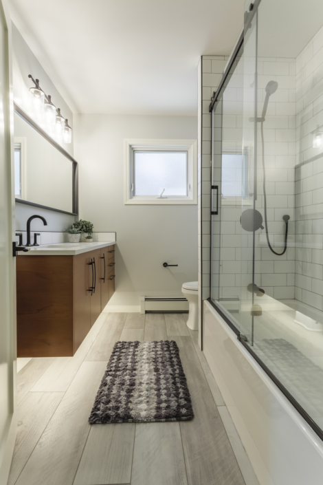
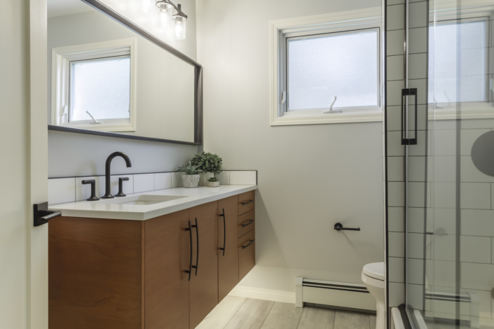
Speaking of tile, I was also super excited to be able to use the fabulous touch of patterned tile in the bathroom. I love when clients are open to adding that little extra splash!
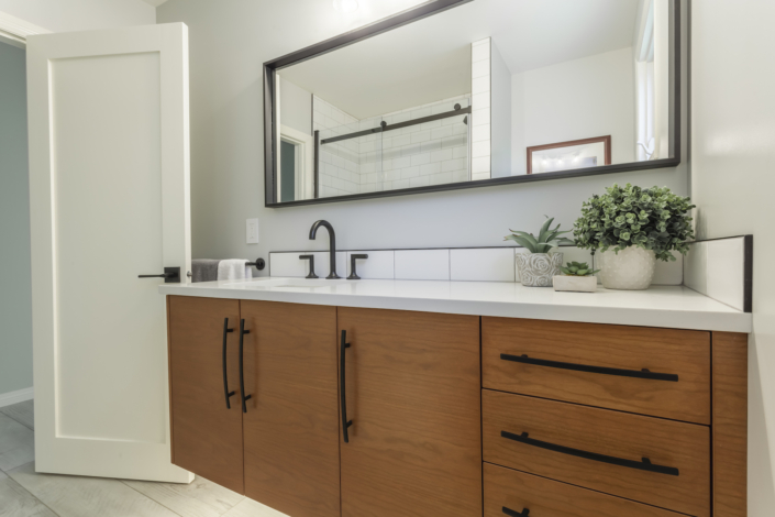
We worked together choosing tile, counter tops, hardware, cabinet colours, flooring, paint, lighting, plumbing etc. Much goes into the planning and details of a renovation. I love helping my client’s to find the pieces that really are beautiful to them, but also make sense with the whole picture. We consulted on furnishings throughout the process as well. The final step was the window coverings. We went for the style and function of Hunter Douglas Cellular shades, but we also added in 2 custom made linen roman shades in the kitchen and nook. They add that extra depth and warmth to the space.
This project was a joy to work on! As always I thoroughly enjoyed working with my client’s to help give their home new life. We were all pretty happy with the final results and I know the client’s are loving living, functioning and making memories in their new space.
Testimonial for House of J
Les Milner
I want to tell you how great it was to work with you. You made the process of renovating so much easier for me. We are so happy with the way things turned out. Not only do we love our new space, everyone who comes in comments on how beautiful it is. Flooring, lighting, colors, window coverings, furnishings… and more. Thanks for all the wisdom. I couldn’t have done it without you.

