THE BUTCHERY by RGE RD PROJECT
Project Type: Restaurant / Retail
Description
Rge Rd design round 3!
I was honoured to be asked to design Rge Rd’s latest venture The Butchery. I have thoroughly enjoyed doing the designs for Rge Rd since their inception so getting to do what I love most for them a third time felt pretty amazing!
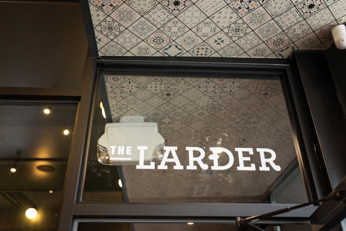
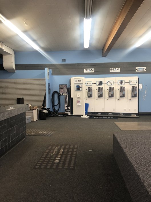
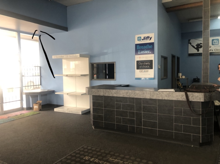
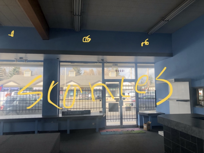
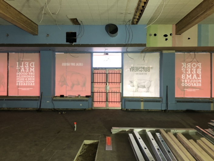
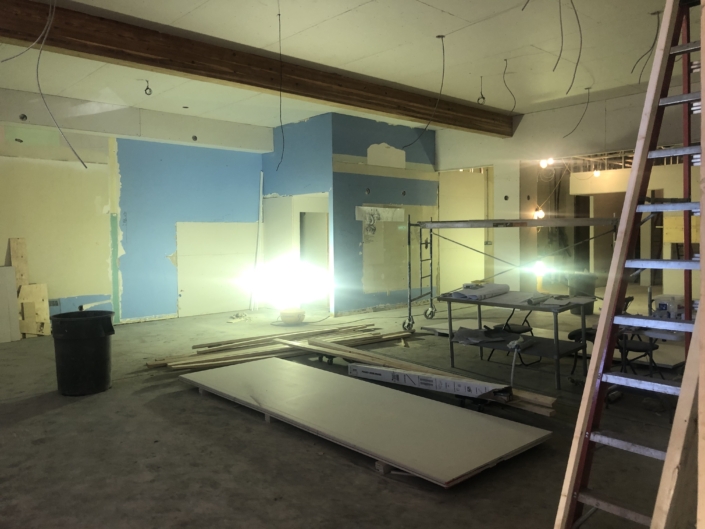
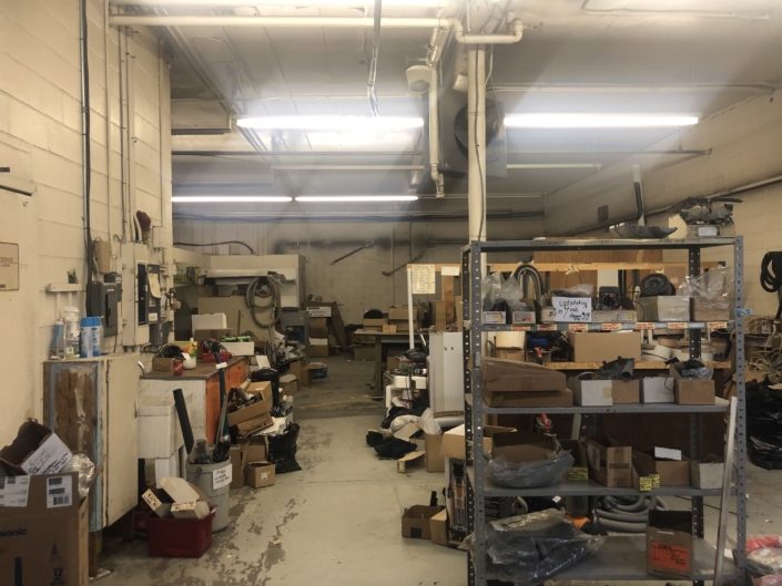
Rge Rd acquired the space beside the original restaurant in the same building. When we first went in it was a vacuum repair store and in rough shape to say the least. We talked about how they envisioned laying out the new butcher shop and what was on their wish list in regards to design. The new space would be divided into the butcher shop, the Larder (a meeting room for private events) a kitchen and an area for prep and possibly classes down the road.
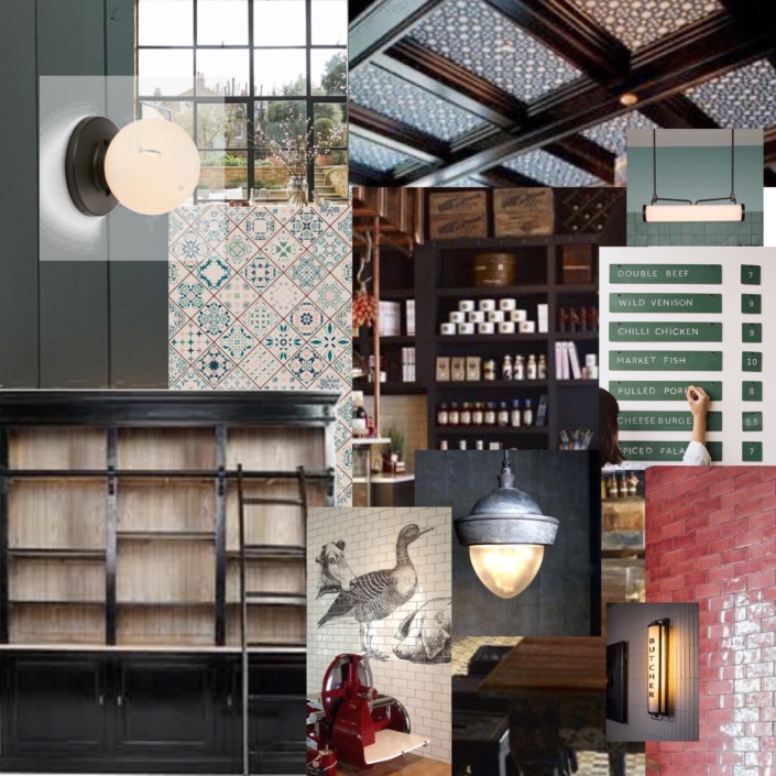
Rge Rd aesthetic has always been cozy, vintage, rustic, raw, and clean. The new butcher shop the client’s wanted to add a bit of an upscale vintage feel, maybe slightly less rustic, but still marrying the rustic roots of Rge Rd.
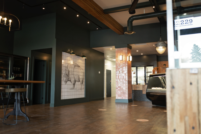
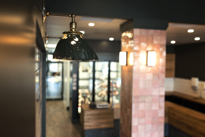
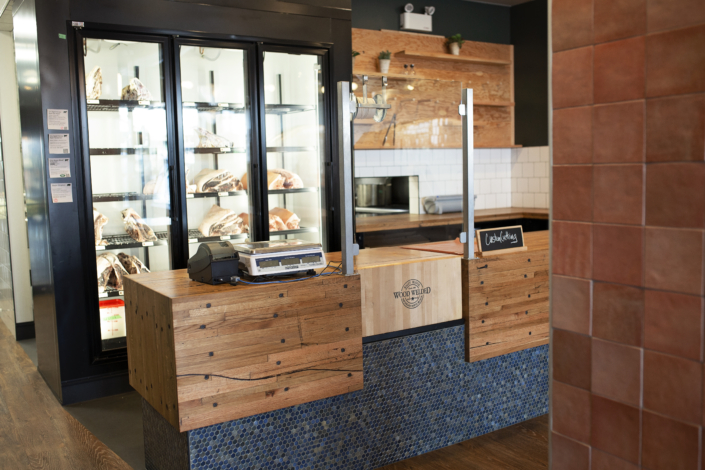
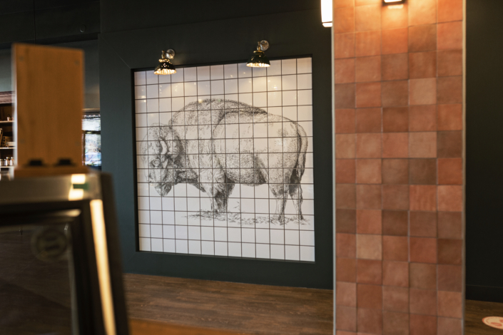
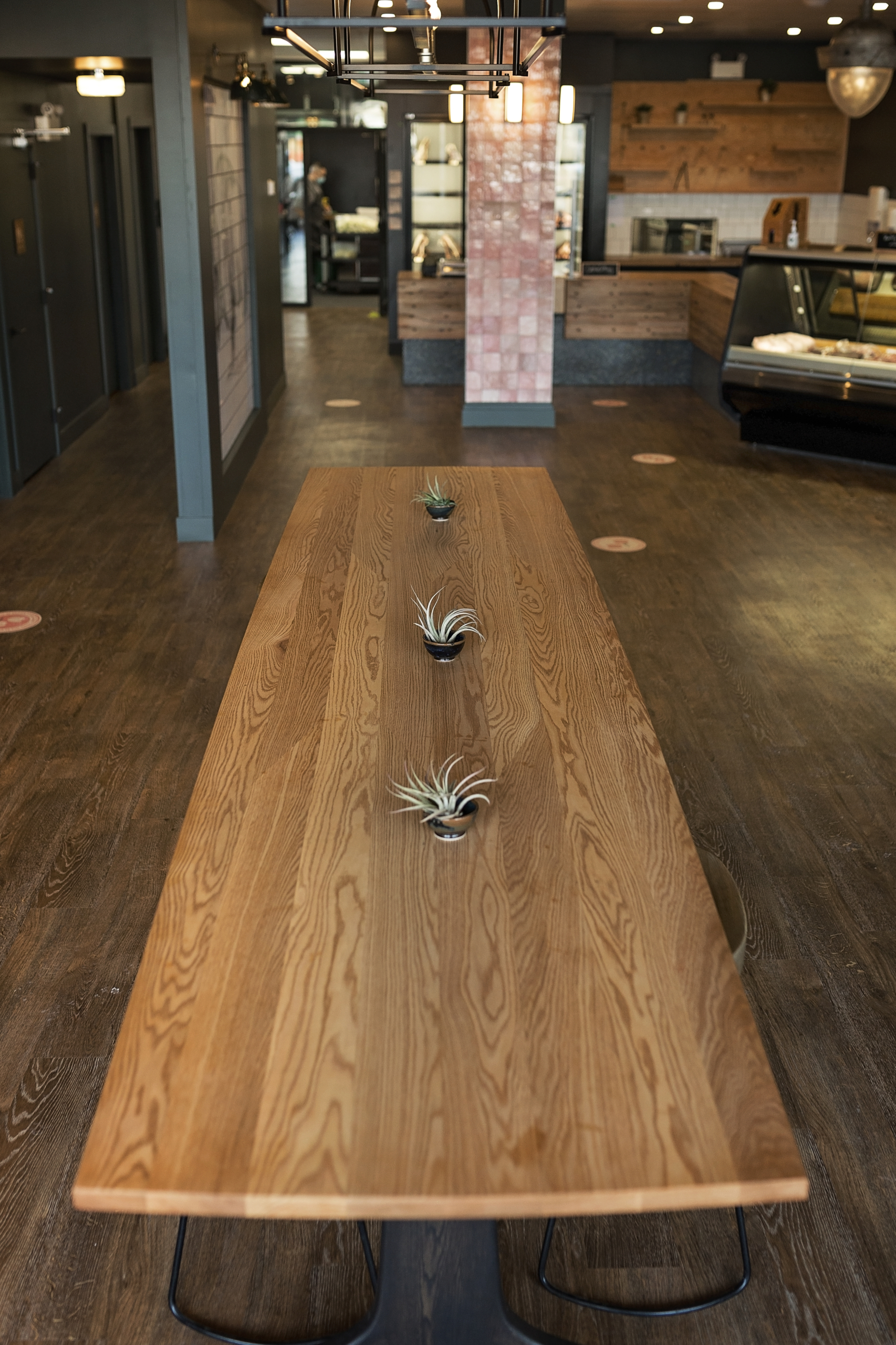
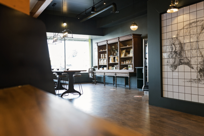
The overall look and feel of the space started to form and we also worked on the layout. There was a support post in the space that we needed to work around. It had to stay, so it needed to look awesome… it is the signature pink tiled post you’ll see in the pics.
As always, I love that the client’s were so open to being adventurous with design and colours. They put their trust in me and it allowed me to really create something special.
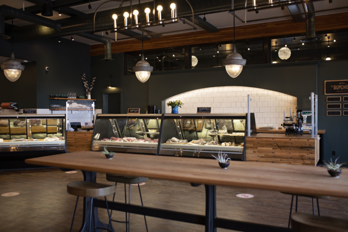
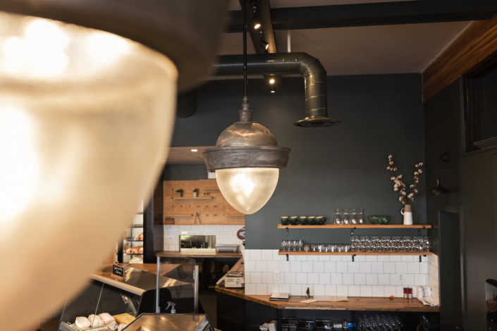
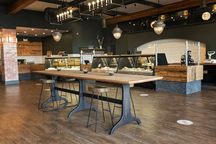
We knew that there would be a lot of meat display cases and a really amazing vintage looking meat cutter. In between we had flat counter tops, but they needed to have character, this was the front display after all.
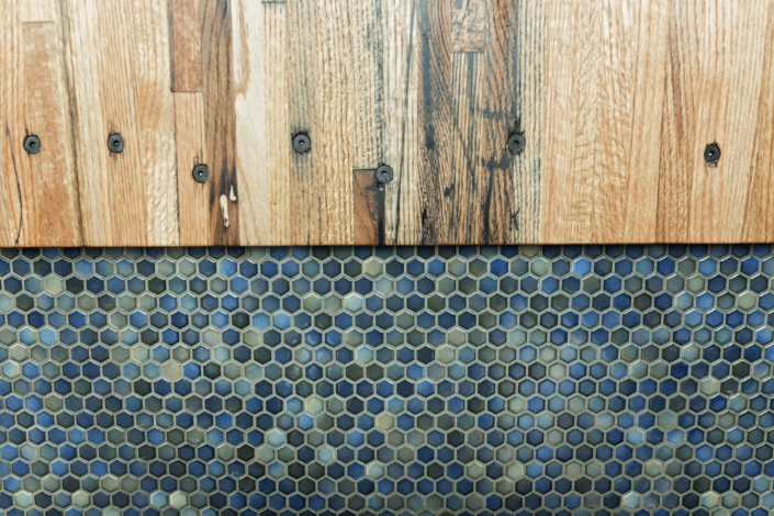
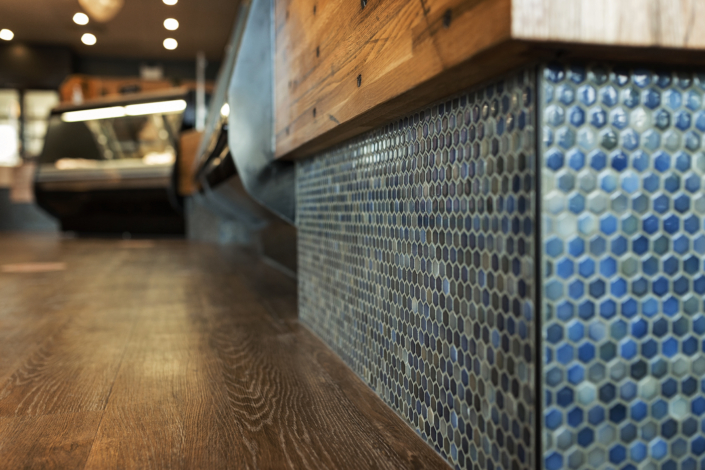
As with the previous spaces, we worked with Urban Timber Reclaimed Wood Co. for some amazing cargo wood counter tops. One of my favourite parts of the counters is that we water fall’d the counter down the front so the cargo wood is really on display. This wood was literally reclaimed from cargo containers and it is so dang cool!
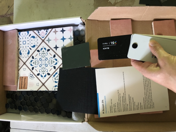
Under the water fall of wood is a multi tone hex tile. The client’s, at first, were hesitant on how it would look, but they were willing to take a chance and were very pleased with the end result.
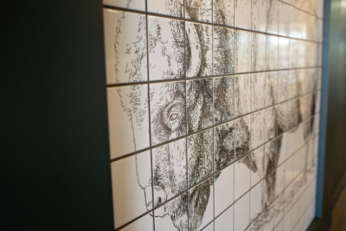
One of my favourite elements that you can’t miss is the bison tile. We gave this guy a bit of a framed out aesthetic and then topped it off with vintage wall sconces. You can see in the pics that the fixture are from another time and they definitely add to the vibe we were going for.
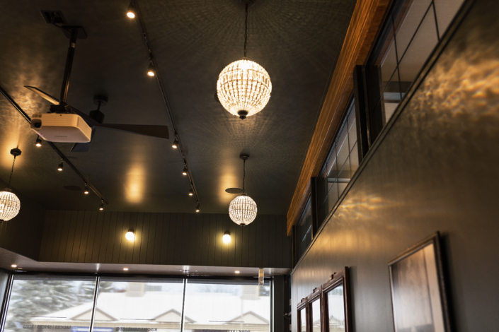
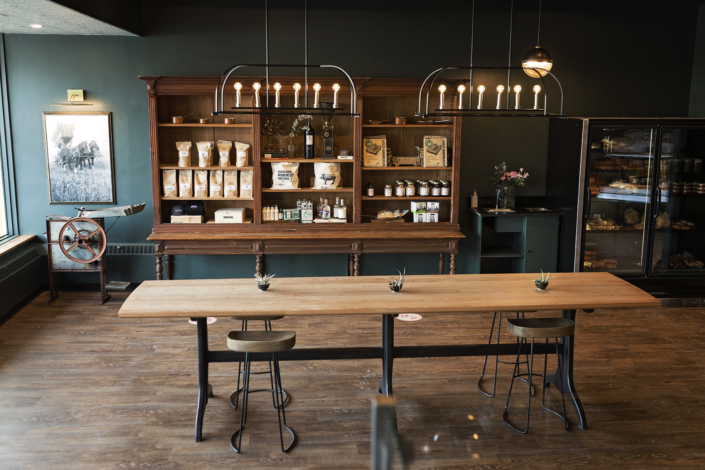
The lighting was a mix of vintage and new and it was like putting together a puzzle from choosing the fixtures to how much lighting and where to put it. There is a lot of lighting in this space, but it is all about function and style. I always say lighting makes or breaks a space. You can have a beautiful space, but if it is not lit properly you miss so much. I have so many favourite fixtures in this space; from the new crystal ball chandeliers in the Larder to the old New York warehouse lights above the front counters.
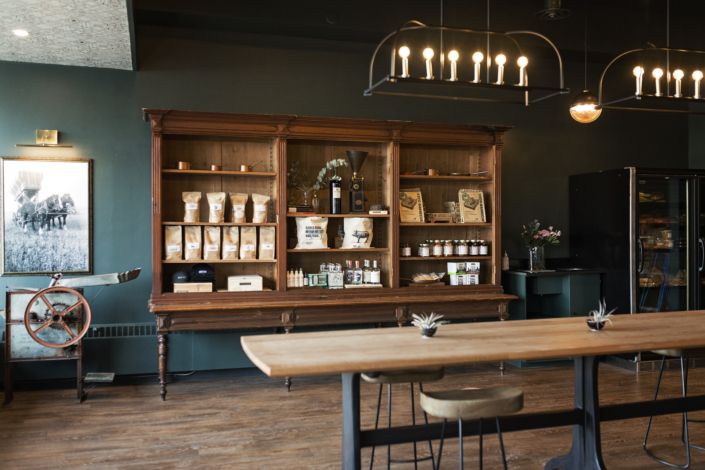
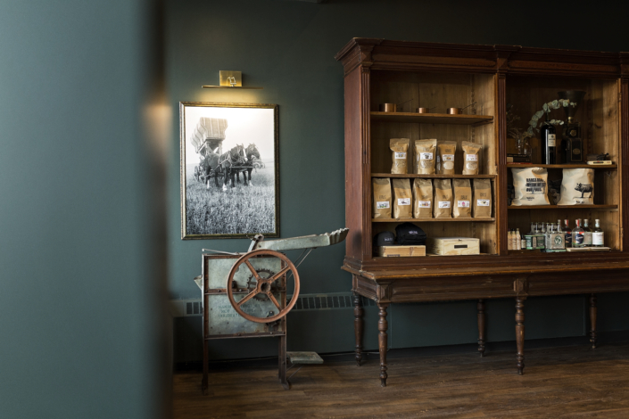
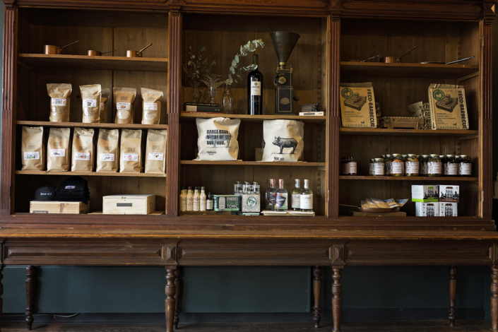
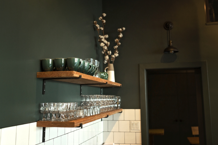
Much thought went into every detail, even the brackets for the display shelves were hand made forged iron. One of my favourite pieces is the wooden display case. I believe it was originally from France, built in the early 1900s. The authenticity and detail of this piece breathes so much character into the space.
Speaking of authenticity, let me tell you about the black and white photos in both the shop side and the Larder. The client’s sent me a bunch of old family photos from their family farm. I had 2 blown up and framed. I love the character they bring to the space and that behind them is a story that belongs to the owner’s of Rge Rd.
In the beginning one of the perceived struggles with the design was the massive bulk head that runs the entire front and north span of the perimetre of the space. It had to stay, which meant, we had to make it look fabulous!
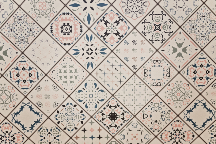
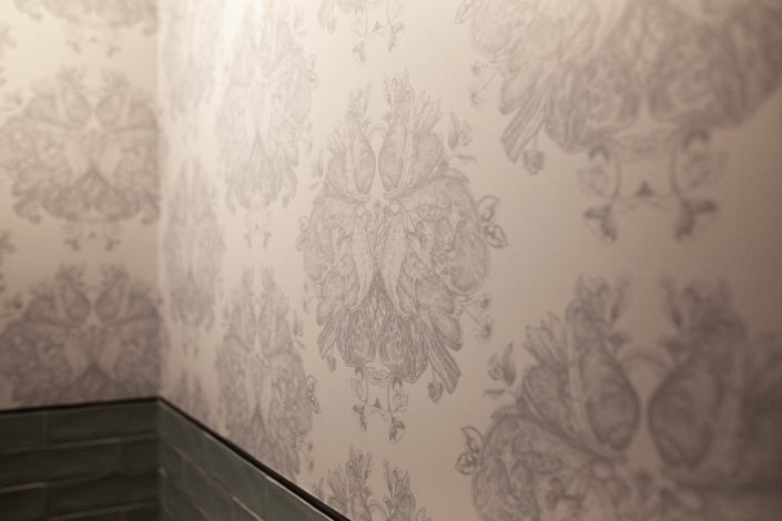
I found a super fun vintage patterned wall paper that we were able to customize colour and pattern size. It was actually from the Ukraine! This is the wallpaper that runs on the underside of the bulkhead. Just a touch of whimsy really.
The front elevation of the bulkhead we did in shiplap and then I found some milk glass globe lights to complete the look.
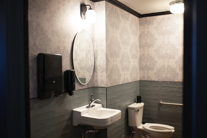
Speaking of wall paper…let’s move to the washrooms. A washroom in any public place speaks volumes. It can make or break the feel of a space.
We knew we wanted the washrooms to be something special. I found some awesome vintage looking tile and the plan was to pair it with wallpaper. The wallpaper needed to also feel somewhat traditional. The look we were going for was a large scale damask pattern.
Enter the client’s graphic designer extraordinaire! She created a pattern literally out of meat! It looks like a stunning damask, but look closely and you’ll see pork chops! We worked together on size and colour and I have to say I love the end result.
I truly loved working on every detail of this space, colours, design, lighting, finishes, layout, everything. As a designer this is dream job stuff!
I hope you love seeing and being in the space as much as I enjoyed designing it.
Testimonial for House of J
Caitlin Fulton from RGE RD Restaurant in Edmonton (www.rgerd.ca)
While we were in the process of the purchasing a space for our upcoming restaurant RGE RD, we were connected to House of J, an Edmonton interior design company. Jennifer was a great fit right off the bat, and we began working together even before we had keys to the new space.
My partner and I already had a very strong concept for our space in mind – Jennifer took our vision and turned it into a reality without compromising her own approach to design, which we found organic, not contrived or over-designed like many newly renovated spaces.
In addition to being able to interpret our needs right away, Jennifer was incredibly present throughout the whole process. She communicated clearly with the restaurant contractor and was always on-site when we needed her.
All in all, we ended up with a space that our restaurant guests love – they love the warm atmosphere, they feel instantly at ease, they feel at home. Jennifer helped us create a space that we, and our customers, are truly connected to, and we didn’t hesitate to invite her onboard for our upcoming design project.

