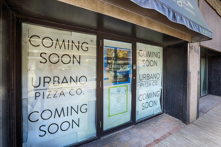
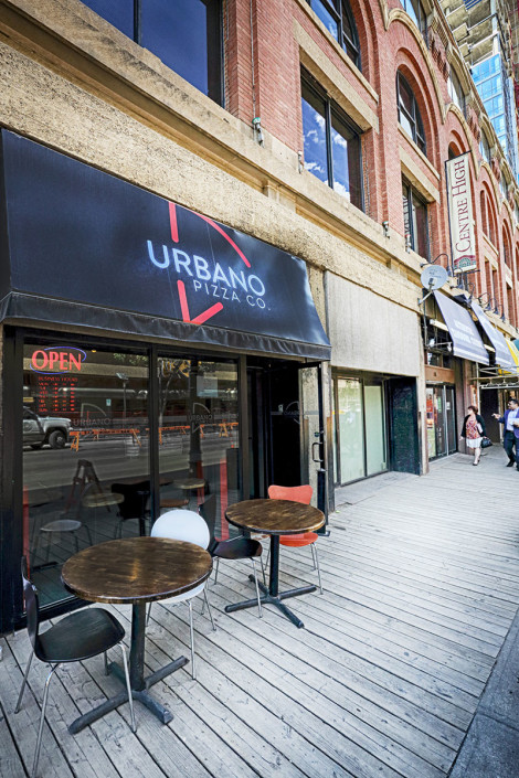
Urbano Pizza Co. Project – Downtown Edmonton on the Boardwalk
Project Type: Restaurant
Urbano Pizza Co. – a design story
My amazing general contractor, Steve Greene with Allendale whom I’d worked with RGE RD on, told me he was putting in a proposal for renovating a space for a new #yeg pizzeria. He asked me if I would meet with the clients who also happened to own Sabor Divino and Bodega Tapas. Of course, I was eager to meet them and see what this project was all about.
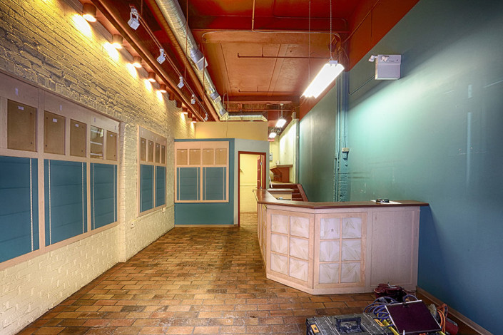
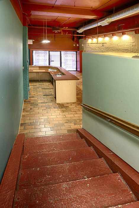
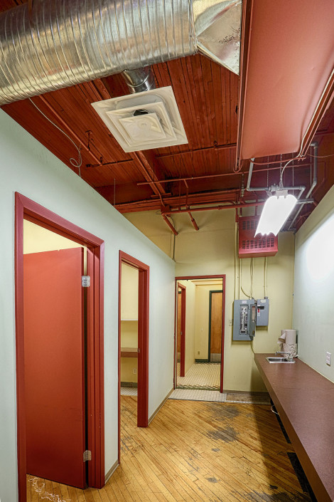
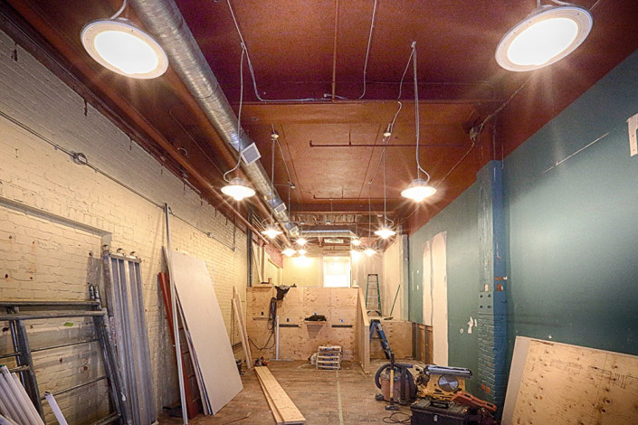
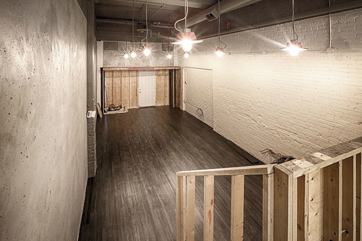
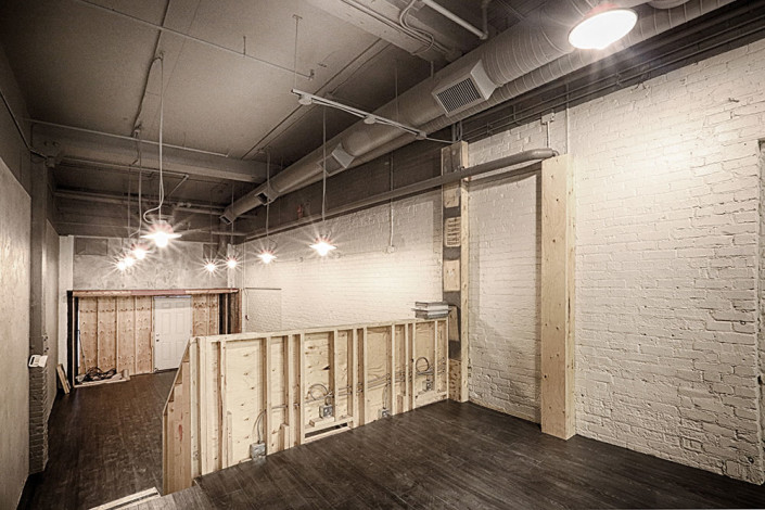
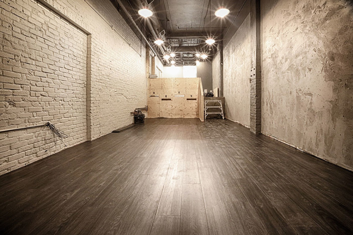
I met with the clients and Steve. The client’s knew exactly what type of restaurant they wanted to open. It could be described as boutique styled fast food pizzeria. They showed me space they had leased for the project; a long narrow two levelled room in a beautiful old heritage building in downtown Edmonton. Although rooms existed from the previous business, the raw space was a designers dream. The client’s showed me a proposed rendering they had received from another design firm. It utilized the exposed brick and incorporated some traditional elements that had a funky twist. The rendering was very appealing. At this point, I wondered what they were looking for from me as they already had employed a design firm and had a design they were satisfied with.
We spoke a little longer and I learned more about what they were wanting from me. They liked the idea of the design they had, but weren’t committed to it. They wanted me to help them with all the finishing of the space. Choosing paint colours, recommending lighting and layout, choosing flooring and the list went on. They needed somebody to understand their vision and bring it to life. In that first meeting we clicked. I think early on the clients trusted that Steve and I were the right team for creating their Pizzeria.
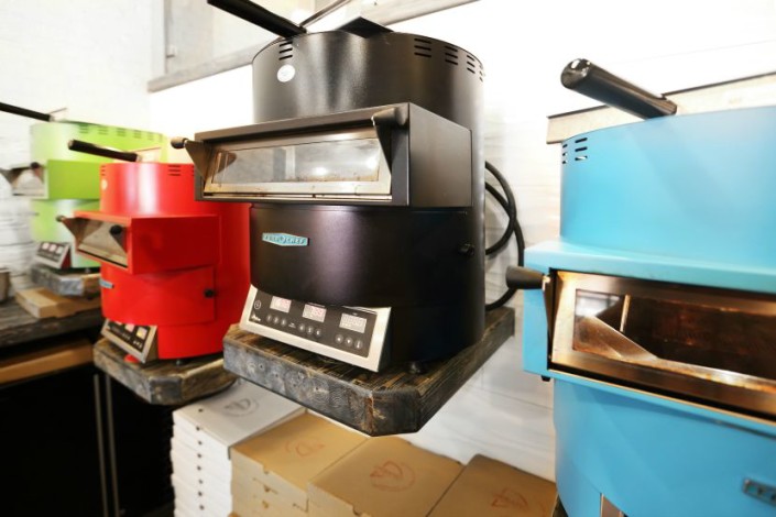
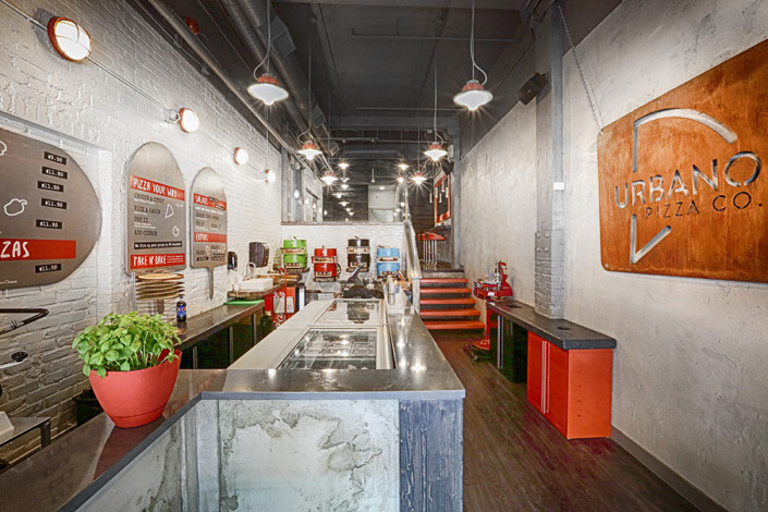
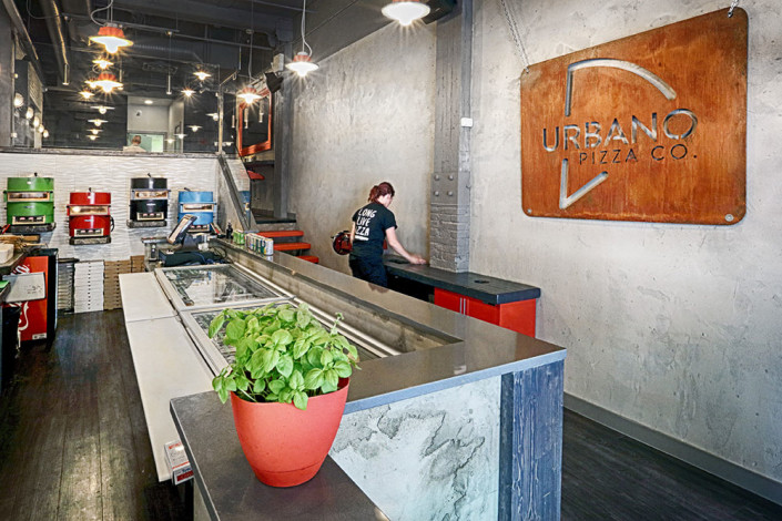
We got to work almost immediately. Steve and his crew began with the demolition. Early on the client’s showed me a pizza oven they were thinking of purchasing. They wanted my opinion on the look of it. It was a very modern compact oven that looking almost like a brightly coloured robot! It could cook a single pizza in about a minute. It was so modern and funky, not to mention functional for their needs. And colour! It came in colours! This was where the design inspiration truly began for Urbano Pizza Co.
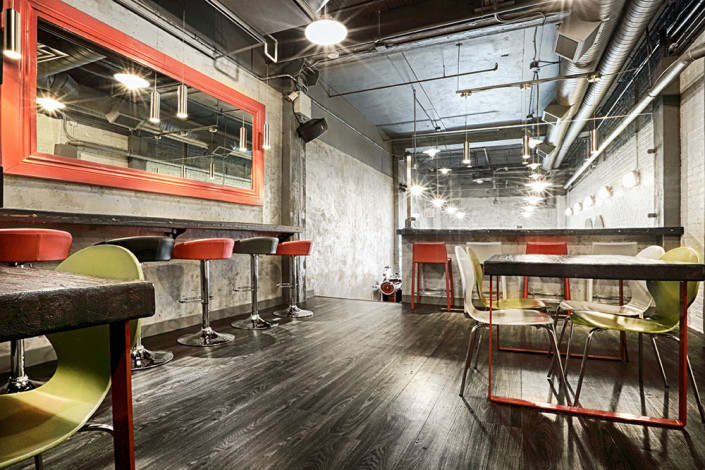
The design style could be called modern industrial.
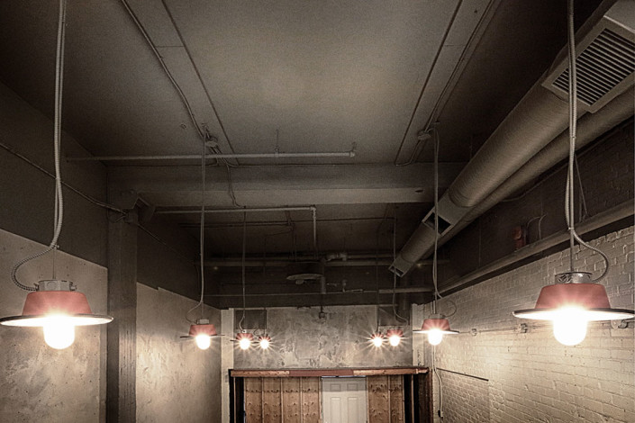
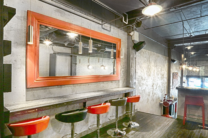
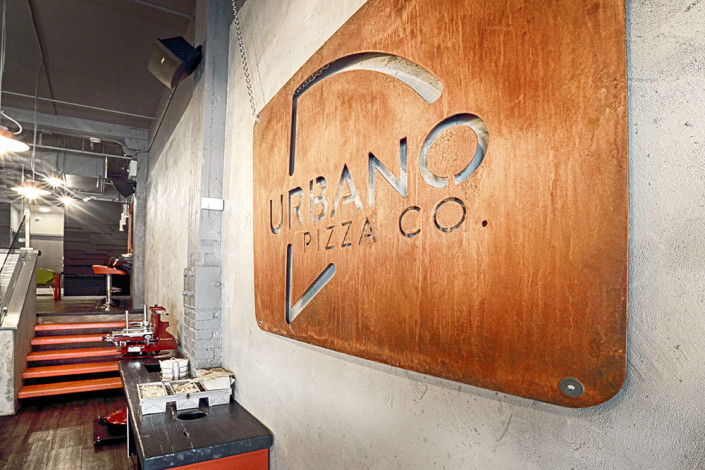
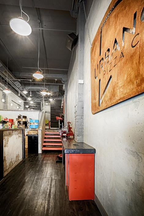
In the early days the client also showed me some old light fixtures that they had found unused and abandoned in the building, they wondered if they could be utilized in their space. I saw them and was thrilled! Raw, vintage, industrial fixtures, but even better, they were authentic, not replica. There were some caged flush mount fixtures as well as hat shaded pendants. Working from the pizza oven inspiration, I decided very quickly that the shades and cage should be painted “pizza oven red.” We needed a flash of modern thrown in this lighting mix and added clean nickel cylinder spot light pendants to hang neatly above the eating bars.
That red colour soon became an important part of the design style as well as the Urbano logo.
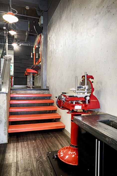
The space has the ground level and a second level that is only a few steps up. The original steps were warehouse raw, but not in a good way. We needed to replace them. Steve had mentioned to me that he had done floating stairs before and immediately I jumped on the idea for the Urbano space. Floating, pizza oven red, stairs!
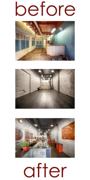
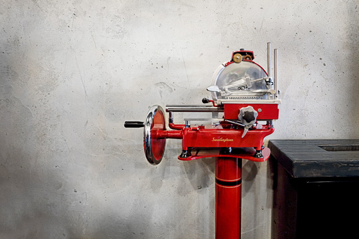
We had some excellent modern elements happening in the space including the pizza ovens, the cylinder pendants and glossy wavy white large subway tile back drop for the pizza ovens. The rustic industrial elements such as old brick and wood beams were already authentic to the space. But we needed to add to more of that industrial feel. Steve’s talented painter/tradesperson was able to turn drywall into concrete! He had an incredible knack for giving us an aged concrete look. His work can be seen on one whole wall of Urbano, above the door and the front facade of the counter. It would be difficult for anyone to look at the concrete wall in which the metal Urbano Pizza Co. logo hangs, and believe it is not an actual concrete wall. I suppose I’ve let the secret out!
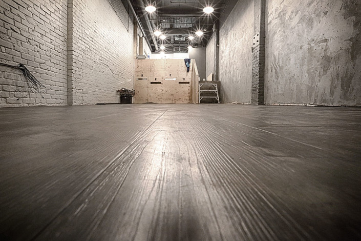
Moving onto flooring. A functional floor was a no-brainer. With high traffic we needed cleanable and durable. However, from my perspective, it needed to look amazing too. Luxury vinyl plank glued down became the best option. I really wanted black. Some felt it would show too much dirt. However, when I looked at the black wood grained plank, I could see it wasn’t a flat black and I felt the texture would be enough to hide the daily wear of such a floor. Fortunately the client agreed and we were able to put in the beautiful black wood grained vinyl.
Steve, had the vision to create floating chunky wood shelves for our featured pizza ovens, after deciding the height and layout, my job was to choose the stain. I coordinated a black stain from the flooring. The stain allowed us to still see plenty of the beautifully textured wood grain, but kept the look from going toward rustic cozy. I was going more for rustic edgy.
The old painted brick walls were re-painted an soft grey white. The ceiling and trims an encompassing industrial grey, not warm, but not cool either. The space was coming together.
Looking at the far back wall on the second level, it was clear we needed a feature. Steve and I wanted to give the clients something that was not seen everywhere else. The two of us came up with a wood wall idea. Mixing different pieces and sizes of wood. In the original plan, the pops of green, red, and blue from the pizza ovens as well as a couple other coordinated pops of colour would be added to various wood pieces on the wall. We began this process. The client’s weren’t sure if they wanted the pops of colour. After much deliberation they opted for the solid matte black that is seen today on the wood wall. They preferred the simplicity of the black.
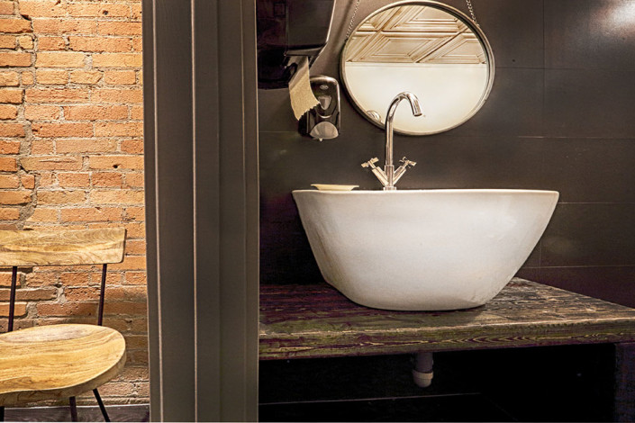
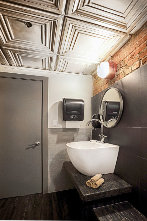
The washroom at Urbano was almost a project in itself. It was the only room where there was still unpainted exposed red brick. I really wanted to keep this element. It was only on the top 1/4 of one wall. I decided to juxtapose that raw brick with concrete looking larger tiles. Ironically Steve and I both came across the oversized modern white porcelain sink on separate occasions and we both thought it would be perfect for Urbano. I still wanted a vanity of sorts in the space, but I thought it would be cool if we could lower it and take it the length of the room. Steve, had no problem building it.
The icing on the cake in this room was the ceiling tile. T-bar ceiling was necessary, but with that came opportunity for something more unique. Through one of Allendale’s suppliers we were able to get the perfect ceiling tile to compliment our modern industrial washroom.
The round mirrors, hanging off of our vintage caged light wall sconces, finished the mood and style in the washroom.
Urbano Pizza Co. in the heart of downtown Edmonton was an exciting restaurant to have the great opportunity to work on. I thoroughly enjoyed working with the client’s and hope to have the chance to do so again. And as usual, one magic ingredient in my design, is working with my amazing contracting company Allendale.

